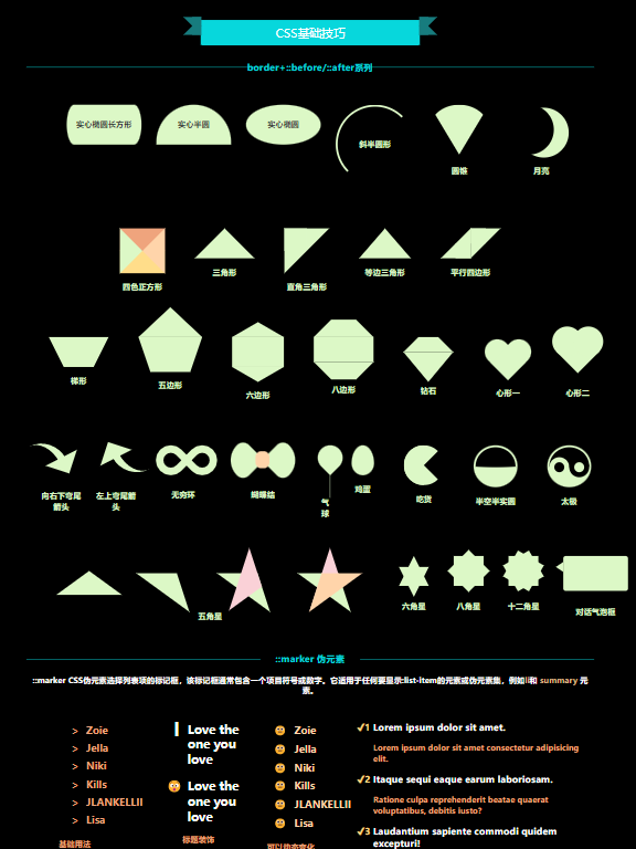
css基础玩法 🧪
前言 📄
虽从事前端行业许久,但从未真的学学习过 css 的属性。趁此机会就学习了下,发现 css 真有趣,真的是宝藏 😍。
简介 🔖
CSS 的 border 简写属性用于设置元素的边界。它设置 border-width, border-style 和 border-color 的值。
1、border-radius 🔲
组成性质,该属性是以下 CSS 属性的简写:
border-top-left-radiusborder-top-right-radiusborder-bottom-right-radiusborder-bottom-left-radius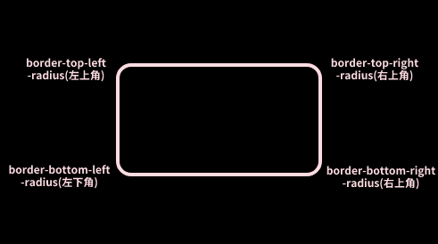
border-radius 属性被指定为:
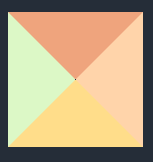
border-radius:左上 右上 右下 左下,可设置 1、2、3 或 4 个<长度>或<百分比>的值,这是用来设置一个单一的半径角.border-radius:上1 上2 下3 下4 / 左1 右2 右3 左4, 后面可选“/”和 1、2、3 或 4 个<长度>或<百分比>值,这是用来设置一个额外的半径,所以你可以有椭圆角,如下图: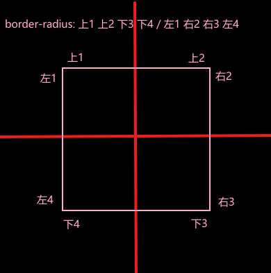
✏ 举个基础栗子:
border-radius CSS 属性的作用是使元素的外边框圆角。您可以设置一个半径来制作圆角,或设置两个半径来制作椭圆角。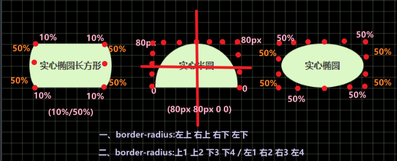
1
2
3
4
5
6
7
8
9
10
11
12
13
14
15
16
17
18
19
20
21
22
23
24
25
26
27
28
// html
<div class="flex margin30">
<div class="rectangleellipse solid">实心椭圆长方形</div>
<div class="halfcirclesolid solid">实心半圆</div>
<div class="ellipse solid">实心椭圆</div>
</div>
// css
/* 实心椭圆长方形 */
.rectangleellipse {
width: 150px;
height: 80px;
line-height: 80px;
border-radius: 10%/50%;
}
/* 实心半圆 */
.halfcirclesolid {
width: 150px;
height: 80px;
line-height: 80px;
border-radius: 80px 80px 0 0;
}
/* 实心椭圆 */
.ellipse {
width: 150px;
height: 80px;
line-height: 80px;
border-radius: 50%/50%;
}🖊 结合 border-radius 其他属性:
1
2
3
4
5
6
7
8
9
10
11
12
13
14
15
16
17
18
19
20
21
22
23
24
25
26
27
28
29
30
31
32
33
34
35
36
37
38
39
40
41
42
43
44
45
46
47
48
49
50
51
52
53
54
55
56
57
58
59
60
61
62
63
64
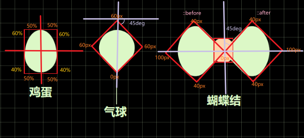
65/* 鸡蛋 */
.egg {
width: 45px;
height: 60px;
background-color: var(--light-green);
border-radius: 50% 50% 50% 50%/60% 60% 40% 40%;
}
/* 气球 */
.balloon {
position: relative;
width: 0;
height: 54px;
}
.balloon::before,
.balloon::after {
content: "";
position: absolute;
}
.balloon::before {
width: 50px;
height: 50px;
border-radius: 60px 60px 0 60px;
background-color: #dcf8c6;
transform: rotate(45deg);
}
.balloon::after {
width: 1px;
height: 45px;
background: #dcf8c6;
top: 60px;
left: 24px;
}
/* 蝴蝶结 */
.bow-tie {
position: relative;
}
.section {
position: absolute;
width: 28px;
height: 34px;
border-radius: 38%;
background-color: #ffd4aa;
left: 36px;
top: 10px;
z-index: 1;
}
.bow-tie::before,
.bow-tie::after {
content: "";
position: absolute;
width: 60px;
height: 60px;
background-color: #dcf8c6;
}
.bow-tie::before {
border-radius: 100px 40px 0 40px;
transform: rotate(-45deg);
left: -20px;
}
.bow-tie::after {
border-radius: 40px 100px 40px 0;
transform: rotate(45deg);
left: 60px;
top: 0;
}
2、利用 border 实现三角形 🔺
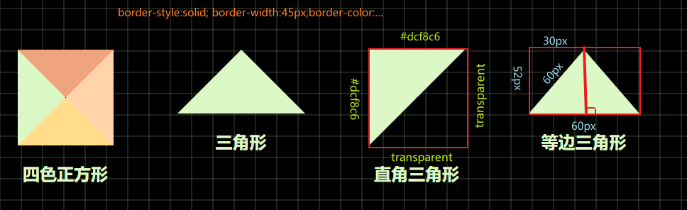
【解释】css 画三角形原理是利用盒子边框完成的,是边而不是真的具有内容的区域。css 的盒子模型内容如下: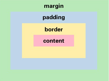
【实现步骤】
1、设置一个盒子
2、设置四周不同颜色的边框
1
2
3
4
5
6
7
8
.box {
width: 300px;
height: 300px;
border-top: 45px solid #efa47d;
border-right: 45px solid #ffd4aa;
border-bottom: 45px solid #ffdd8a;
border-left: 45px solid #dcf8c6;
}
3、将盒子宽高设置为 0,仅保留边框
1 | |
- 4、得到四个三角形后,选择其中一个后,其他三角形(边框)设置颜色为透明
1 | |
【衍生多边形 🔸】,如下:
三角梯形组合
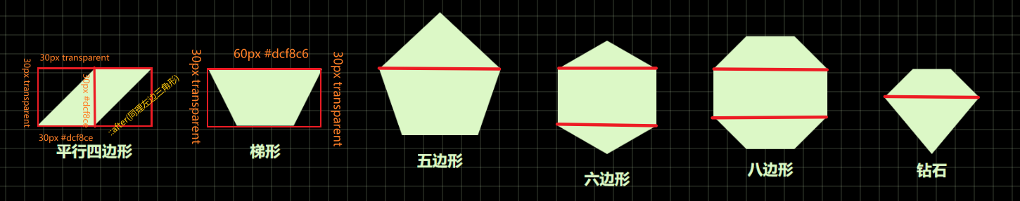
- 平行四边形:
1 | |
- 梯形:
1 | |
其他的五边形、六边形、八边形、钻石均由三角形和梯形组合而成
三角正方形组合
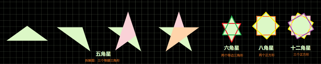
1 | |
3、利用 border 属性实现多类型图形 ♾️
圆弧类
- 示例图
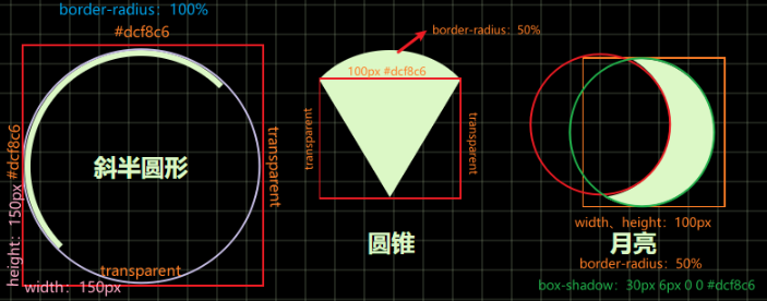
- 实现代码
1
2
3
4
5
6
7
8
9
10
11
12
13
14
15
16
17
18
19
20
21
22
23
24
25
26
27
28
29/* 斜半圆形 */
.italichalfcirclehollow {
width: 150px;
height: 150px;
line-height: 150px;
border-width: 4px;
border-style: solid;
border-color: #dcf8c6 transparent transparent #dcf8c6;
border-radius: 100%;
}
/* 圆锥 */
.cone {
position: relative;
width: 0;
height: 0;
padding: 0;
border-left: 60px solid transparent;
border-right: 60px solid transparent;
border-top: 100px solid #dcf8c6;
border-radius: 50%;
}
/* 月亮 */
.moon {
position: relative;
width: 100px;
height: 100px;
border-radius: 50%;
box-shadow: 30px 6px 0 0 #dcf8c6;
}- 示例图
心形 💕
示例图
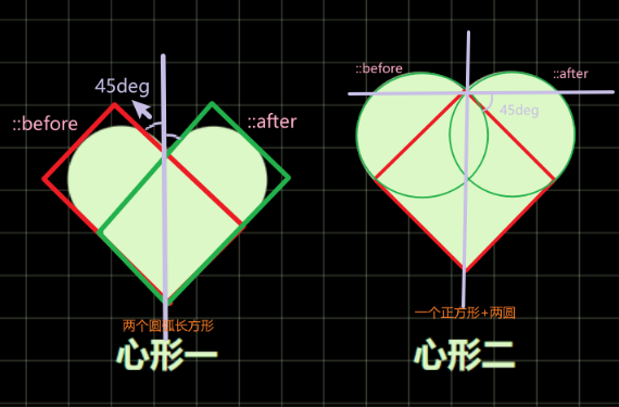
实现方式有两种:
(1)两个圆弧长方形旋转拼接
(2)一个正方形+两个圆实现代码
1
2
3
4
5
6
7
8
9
10
11
12
13
14
15
16
17
18
19
20
21
22
23
24
25
26
27
28
29
30
31
32
33
34
35
36
37
38
39
40
41
42
43
44/* 方法一 */
.heart {
position: relative;
width: 100px;
height: 60px;
}
.heart::before,
.heart::after {
content: "";
position: absolute;
width: 50px;
height: 80px;
border-radius: 100px 100px 0 0;
background-color: #dcf8c6;
}
.heart::before {
left: 14px;
transform: rotate(-45deg);
}
.heart::after {
left: 36px;
transform: rotate(45deg);
}
/* 方法二 */
.heart1 {
position: relative;
width: 60px;
height: 60px;
background: #dcf8c6;
transform: rotate(-45deg);
}
.heart1::before,
.heart1::after {
content: "";
position: absolute;
width: 60px;
height: 60px;
border-radius: 50%;
background-color: #dcf8c6;
}
.heart1::before {
top: -30px;
left: 0px;
}更多玩法
示例图
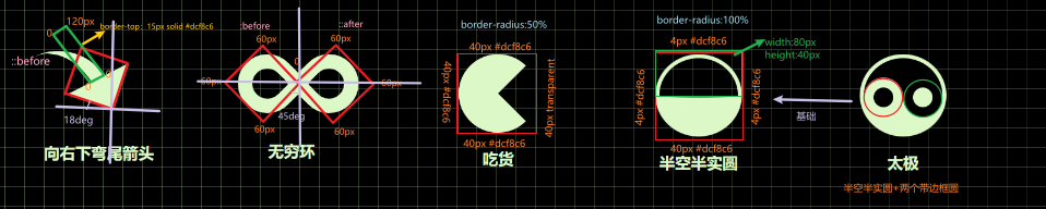
实现代码
1
2
3
4
5
6
7
8
9
10
11
12
13
14
15
16
17
18
19
20
21
22
23
24
25
26
27
28
29
30
31
32
33
34
35
36
37
38
39
40
41
42
43
44
45
46
47
48
49
50
51
52
53
54
55
56
57
58
59
60
61
62
63
64
65
66
67
68
69
70
71
72
73
74
75
76
77
78
79
80
81
82
83
84
85
86/*向右下弯尾箭头*/
.curvearrowrightbottom {
position: relative;
width: 0;
height: 0;
border-top: 50px solid transparent;
border-right: 50px solid #dcf8c6;
transform: rotate(18deg);
}
.curvearrowrightbottom::after {
content: "";
position: absolute;
width: 56px;
height: 56px;
border-top: 15px solid #dcf8c6;
border-radius: 120px 0 0 0;
left: -38px;
top: -56px;
transform: rotate(45deg);
}
/* 无穷环 */
.bow {
position: relative;
}
.bow::before,
.bow::after {
content: "";
position: absolute;
width: 30px;
height: 30px;
border: 15px solid #dcf8c6;
}
.bow::before {
border-radius: 60px 60px 0 60px;
transform: rotate(-45deg);
left: -5px;
}
.bow::after {
border-radius: 60px 60px 60px 0;
transform: rotate(45deg);
left: 58px;
}
/* 吃货 */
.foodie {
width: 0;
height: 0;
border-radius: 50%;
border-top: 40px solid #dcf8c6;
border-right: 40px solid transparent;
border-bottom: 40px solid #dcf8c6;
border-left: 40px solid #dcf8c6;
}
/* 半实半空圆//太极 */
.half-circle,
.taiji {
position: relative;
width: 80px;
height: 40px;
border-radius: 100%;
border-color: #dcf8c6;
border-style: solid;
border-width: 4px 4px 40px 4px;
}
/* 太极 */
.taiji {
background-color: #252d38;
}
.taiji::before,
.taiji::after {
content: "";
position: absolute;
width: 20px;
height: 20px;
border-radius: 50%;
top: 50%;
}
.taiji::before {
left: 0;
border: 10px solid #dcf8c6;
background-color: #252d38;
}
.taiji::after {
right: 0;
border: 10px solid #252d38;
background-color: #dcf8c6;
}